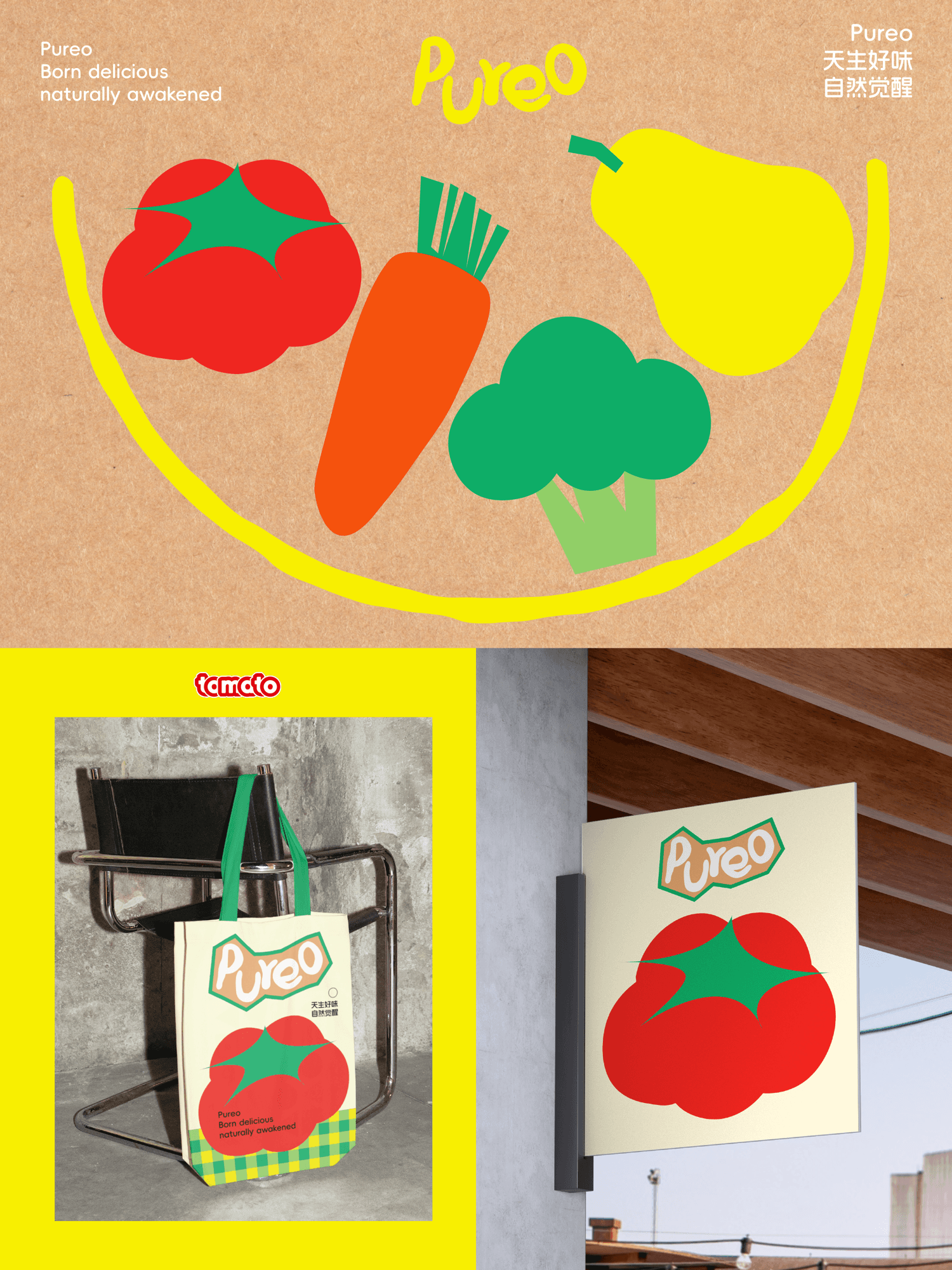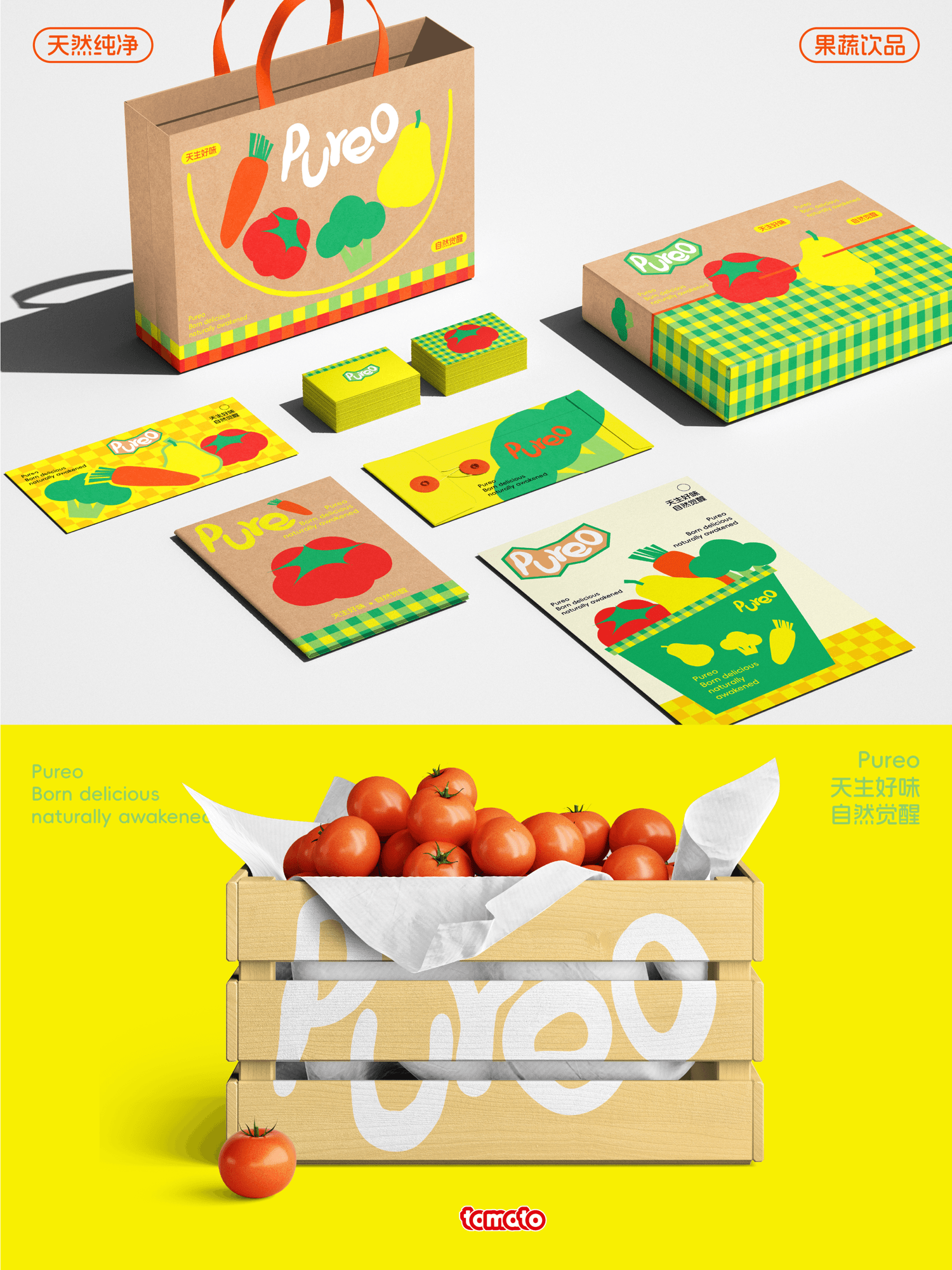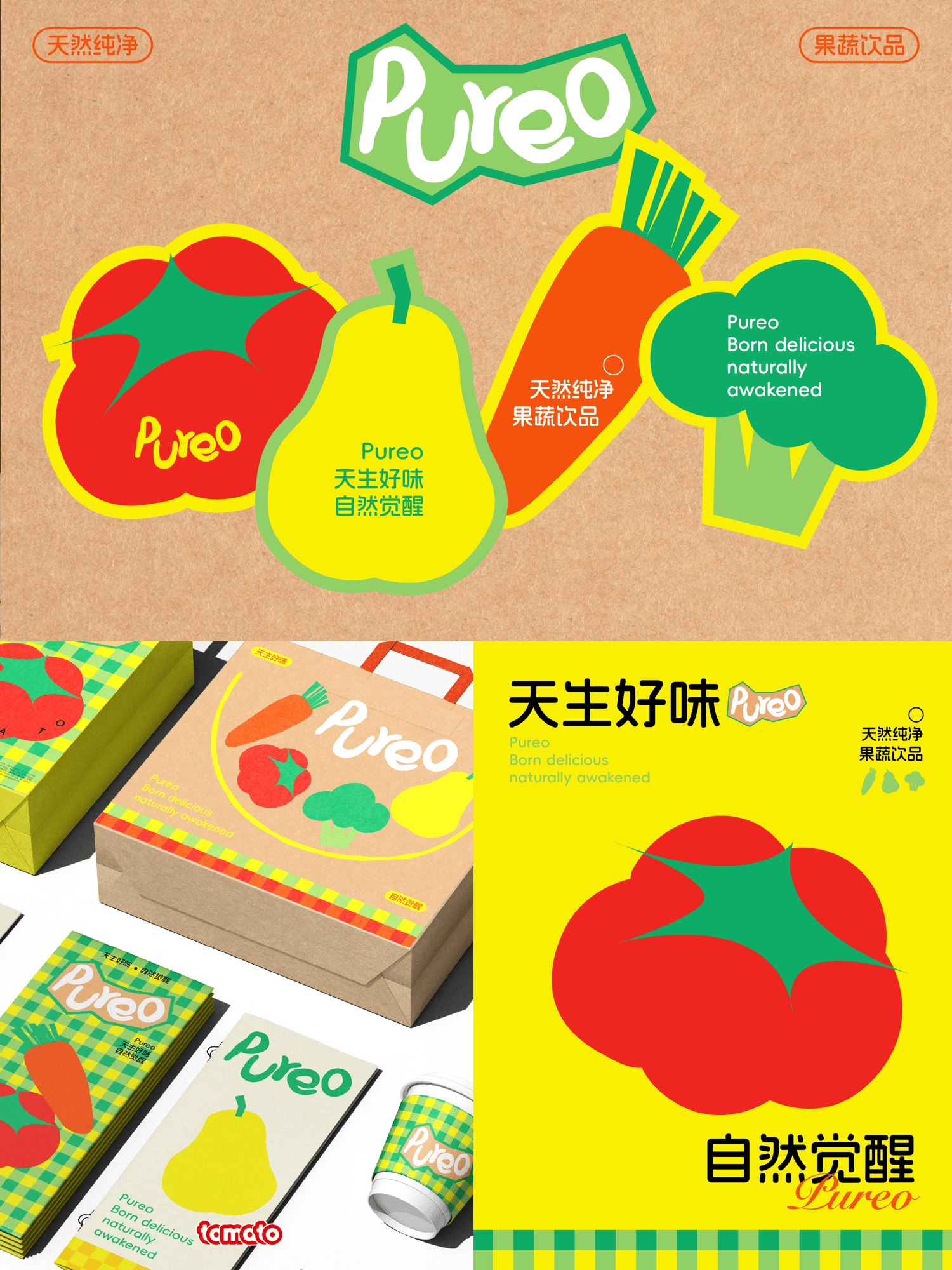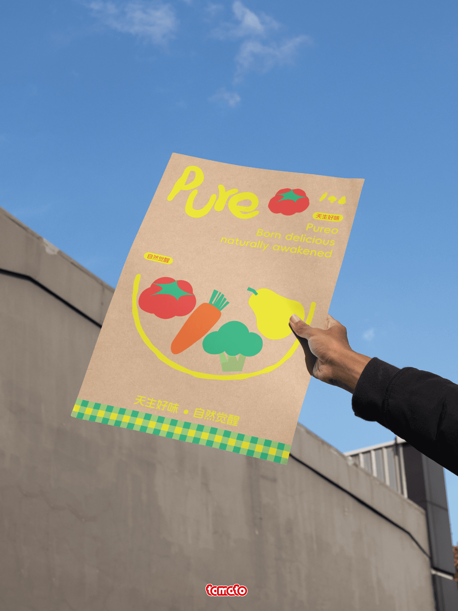
Pureo
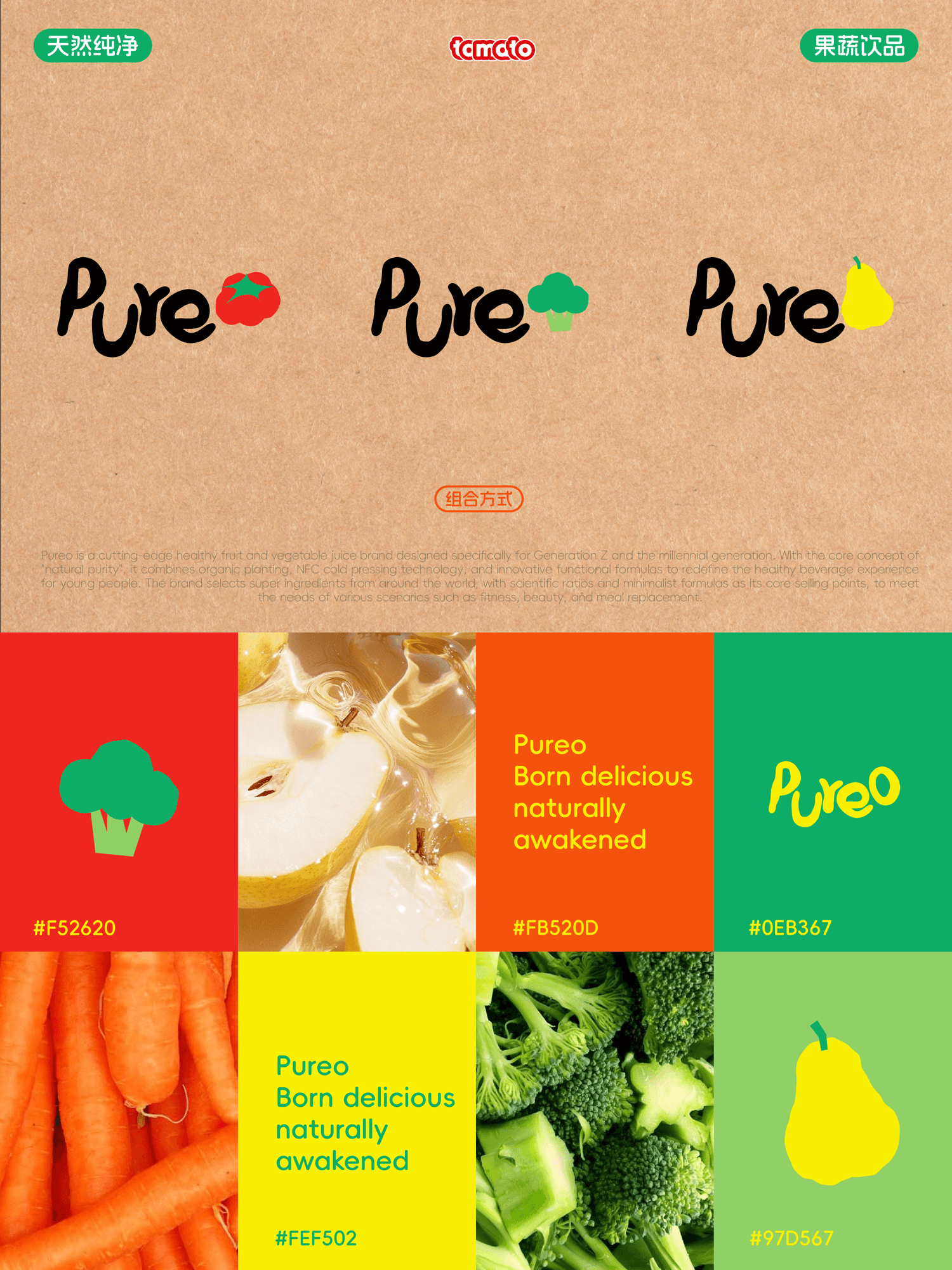
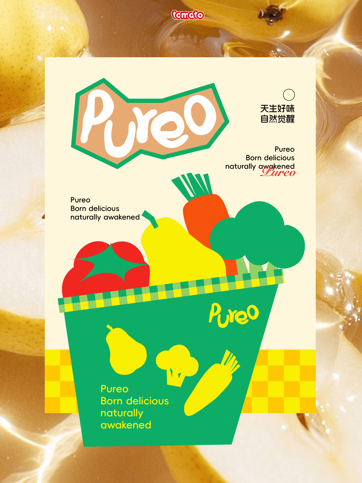
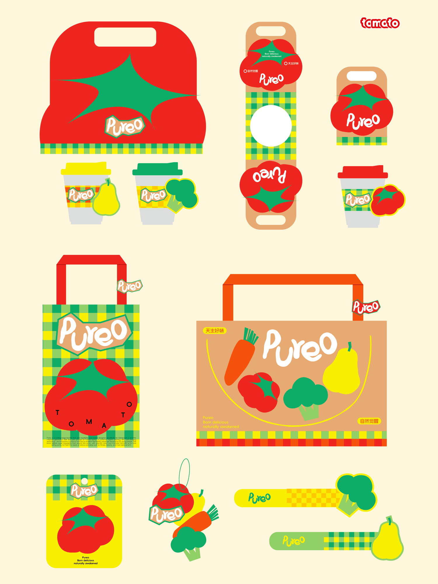
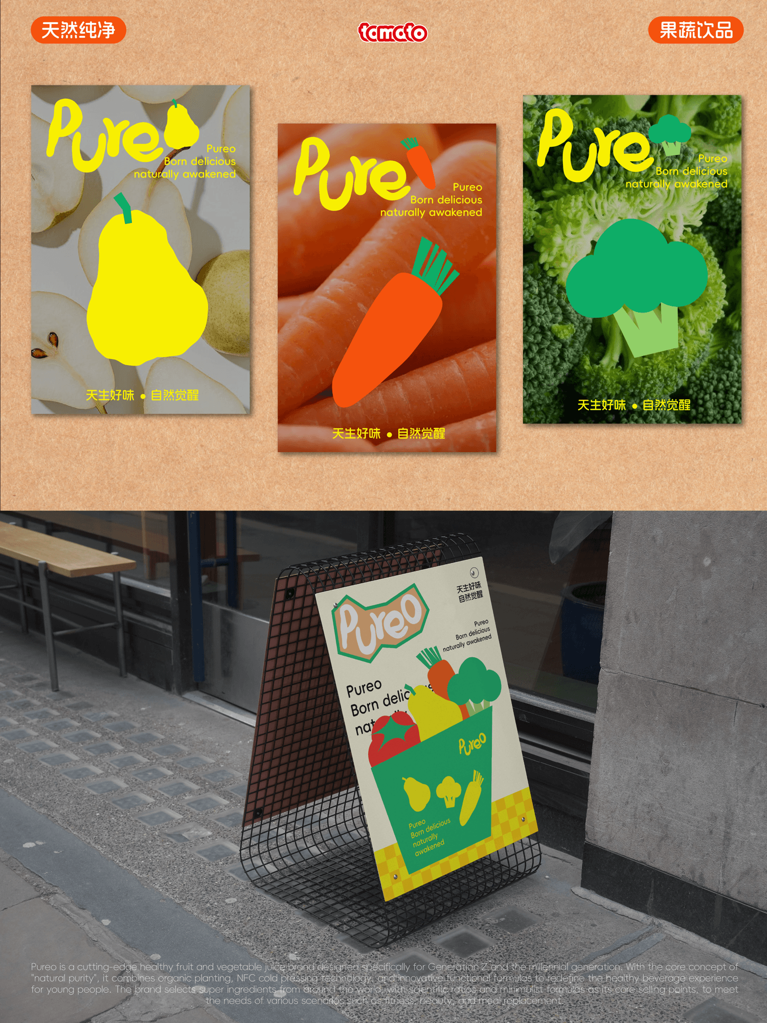
在和品牌主理人的沟通中,我们了解到Pureo品牌核心在于传递天然纯粹、活力趣味的愉悦。因此在logo设计中,我们采用定制化的手绘感字体呈现"Pureo",传递出手作的温度感和自然有机的韵味,品牌核心视觉形象为四种果蔬的抽象插画,象征着产品的多元风味和丰富营养来源。我们还为品牌设计了不同的格纹辅助底纹,为品牌视觉注入结构感、活力感与视觉线索。色彩直接源于新鲜果蔬本身,直观传递天然和健康的属性。
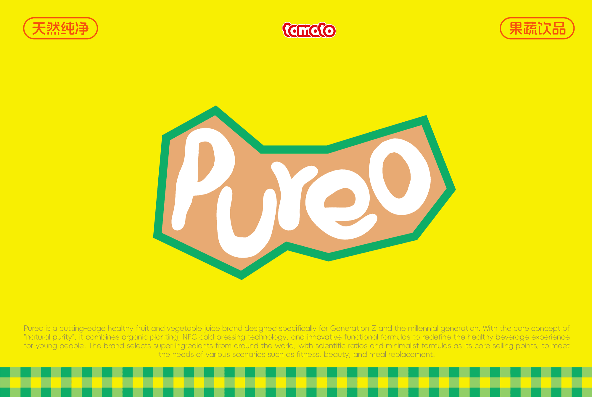
Through communication with the brand founder, we understood that the core of Pureo lies in conveying the pleasure of natural purity and vibrant playfulness. Therefore, in logo design, we use a customized hand-drawn font to present "Pureo," conveying the warmth of craftsmanship and the charm of natural organics. The brand's core visual identity features abstract illustrations of four fruits and vegetables, symbolizing the diverse flavors and rich nutritional sources of the products. We also designed different plaid auxiliary patterns for the brand, injecting structure, vitality, and visual cues into the brand's visual. The colors are drawn directly from fresh fruits and vegetables themselves, intuitively conveying the attributes of naturalness and health.